import polars as pl

new_cols = ['Invoice','Date','Store_Num','Store','Address','City','Zip_Code',
 'Location','County_Num','County','Category_Num','Category','Vendor_Num','Vendor',
 'Item_Num','Item','Pack','Bottle_Vol_ml','Cost','Retail','Bottles',
 'Dollars','Volume_Ltr','Volume_Gal']

liquor_sales = (pl.scan_parquet('data/iowa_liquor_sales.parquet')
 .pipe(lambda lf: lf.rename(dict(zip(lf.collect_schema().names(), new_cols))))
 .filter(pl.col('Date').dt.year().ne(2025))
 .with_columns(pl.col('Store_Num','Vendor_Num').cast(pl.Int16),
    pl.col('Bottle_Vol_ml','Bottles').str.replace_all(',','').cast(pl.Int32),
    pl.col('Cost','Retail','Dollars').str.replace_all(r'[$,]','').cast(pl.Float16),
    pl.col('Volume_Ltr').str.replace_all(',','').cast(pl.Float16))
 .collect()
)5 Anomaly Detection
Important
This book is a first draft, and I am actively collecting feedback to shape the final version until March 1, 2026. Let me know if you spot typos, errors in the code, or unclear explanations, your input would be greatly appreciated. And your suggestions will help make this book more accurate, readable, and useful for others. You can reach me at:
Email: contervalconsult@gmail.com
LinkedIn: www.linkedin.com/in/jorammutenge
Datasets: Download all datasets
My experiences with anomaly detection systems are that thresholds for alerting are rarely well-calibrated. Overly sensitive ones are noise and get ignored, and overly conservative ones miss things.
— Katie Bauer
An anomaly is an item that stands apart from others within the same collection. In the context of data, it refers to an entry, measurement, or value that diverges from the rest in a way that may prompt questions or concern. These unusual points are known by many labels, including outliers, novelties, noise, deviations, and exceptions. Throughout this chapter, I treat anomaly and outlier as equivalent terms, though you may encounter the other names in related discussions. Identifying anomalies may be the primary objective of an analysis or simply one component of a larger analytical workflow.
Anomalies generally arise from two broad sources: genuinely unusual real world events or mistakes introduced during data collection or processing. Although many techniques for spotting outliers apply regardless of their origin, the appropriate response depends heavily on why the anomaly occurred. For this reason, identifying the underlying cause and distinguishing between these sources is a crucial part of the analytical process.
Unusual real world behavior can produce outliers for many reasons. These unexpected data points might indicate fraudulent activity, unauthorized system access, defects in manufactured items, gaps in organizational rules, or product usage that differs from what designers anticipated. Outlier detection is a common tool in financial fraud prevention and is also widely used in cybersecurity. Sometimes, however, an anomaly appears not because someone is acting maliciously but because a user interacts with a product in an unconventional way. For example, a restaurant owner might use a point of sale system to record internal inventory transfers as customer purchases, unintentionally inflating sales totals and average order values. From the system’s perspective, these transactions look extreme compared to normal customer behavior, even though they reflect a legitimate internal process. When anomalies stem from valid use cases, deciding how to handle them requires an understanding of the analytical goals, domain expertise, usage policies, and occasionally the legal framework surrounding the product.
Data can also contain anomalies due to issues in how it is collected or processed. Manually entered information is especially prone to typos or incorrect values. Updates to forms, fields, or validation logic can introduce unexpected entries, including missing values. Web and mobile applications often track user behavior, but any change to the logging mechanism can create irregularities. After spending many hours troubleshooting metric shifts, I have learned to ask early whether any logging changes were recently deployed. Processing pipelines can also generate outliers when filters behave incorrectly, steps fail partway through, or data is accidentally ingested more than once, resulting in duplicates. When anomalies originate from processing problems, it is usually reasonable to fix or remove them with greater confidence. Ideally, upstream data entry or processing issues should be corrected to prevent recurring data quality problems.
In this chapter, I begin by explaining why Polars can be a useful tool for anomaly detection, along with its limitations. I then introduce the Iowa liquor sales dataset used in the examples that follow. Next, I cover the core Polars techniques available for identifying outliers and describe the different categories of anomalies these tools can help uncover. Once anomalies have been detected and interpreted, the next step is deciding how to address them. Not all anomalies are harmful, unlike in fraud detection, cybersecurity, or health monitoring, since they can also highlight exceptional customers, standout marketing efforts, or positive behavioral changes. In some cases, anomaly detection simply passes unusual cases to people or automated systems for further action. In many analyses, however, it represents just one stage in a broader workflow. I therefore conclude the chapter with several approaches for handling or correcting anomalous data.
5.1 Capabilities and Limits of Polars for Anomaly Detection
Polars is a fast and expressive library for many data analysis tasks, but it is not a universal solution. When performing anomaly detection, Polars offers several advantages along with some limitations that may make other tools or languages more appropriate for certain parts of the workflow.
Polars is especially appealing when working with data that already resides in files or formats that can be easily loaded into a dataframe, similar to the approach used in earlier chapters on time series and text analysis. Because Polars is multithreaded, it can process large datasets efficiently. For sizable collections, loading data directly into Polars and performing transformations in memory is often much faster than moving data into a database or relying on slower, row oriented tools. Polars also fits naturally into pipelines where anomaly detection is one step among many, since its lazy API allows complex transformations to be expressed clearly and executed efficiently. The code used to flag outliers is transparent and reproducible, and Polars behaves consistently as new data is ingested.
At the same time, Polars does not provide the full range of statistical and machine learning capabilities found in ecosystems such as R or Python’s scientific stack. While Polars includes many built in aggregation and descriptive functions, more advanced statistical techniques often require passing data to libraries such as SciPy, scikit-learn, or PyTorch. For applications that require extremely low latency responses, such as real time fraud detection or intrusion monitoring, batch oriented dataframe processing may not be ideal. In these situations, a common approach is to use Polars to establish baseline metrics, such as typical ranges or averages, and then implement real time monitoring with streaming frameworks or specialized event driven systems. Polars is also fundamentally rule based. It excels at applying well defined transformations but does not automatically adapt to evolving patterns or adversarial behavior. Machine learning approaches, and the tools built around them, are often better suited to those scenarios.
Now that we have reviewed the strengths of Polars and when it makes sense to use it instead of other tools or languages, we can turn to the dataset used in this chapter before diving into the code itself.
5.2 The Dataset
The data used in this chapter consists of liquor transaction records from the US state of Iowa, collected by the Iowa Department of Revenue, Alcoholic Beverages, from 2012 through 2024. The dataset can be downloaded from the Open Data website.
The dataset contains more than 30 million records. Each record represents a single liquor sale transaction and includes details such as the transaction date, invoice number, store location, product category, number of bottles sold, and total volume. A complete data dictionary is available in the About this Dataset section of the website.
5.3 Detecting Outliers
Although an anomaly is often described as an observation that lies far from the rest, identifying such values in a real dataset is rarely straightforward. The first challenge is defining what “typical” behavior looks like, and the second is deciding when a value should be considered unusual rather than simply rare. As we work with the Iowa liquor sales data, we will focus on bottle counts and gallon volumes to develop an intuition for which values fall within expected ranges and which ones stand out.
In general, the larger and more representative a dataset is, the easier it becomes to assess whether a value is truly unusual. In some cases, analysts have access to explicit labels or reference rules that identify abnormal records. These signals might come from regulatory thresholds, business rules, or prior investigations. For instance, analysts may know that sales spikes around major holidays, such as New Year’s Eve, regularly produce unusually large transaction volumes that are still considered normal. More often, however, no such guidance exists, and we must rely on patterns in the data combined with informed judgment. In this chapter, we assume that the liquor sales dataset is large enough to infer typical behavior directly from the data without depending on external labels.
When working with the dataset, there are several practical ways to uncover outliers. One approach is to sort numerical values, such as bottle counts or gallon volumes, to identify transactions at the extremes. Another is to group the data to find products, stores, or dates that appear with unusually high or low frequency. Polars’ built in descriptive and statistical functions provide additional tools for highlighting values that fall far from the center of a distribution. Finally, visual exploration, using techniques such as histograms, box plots, or scatter plots, can reveal patterns and anomalies that are difficult to detect through summary statistics alone.
5.3.1 Sorting to Find Anomalies
One of the simplest ways to identify potential outliers is by sorting the data, which we do with the sort method. By default, sort uses descending=False, meaning values are ordered from smallest to largest. Setting descending=True reverses this order and sorts values from largest to smallest for the chosen column. The sort method can operate on one or more columns, and each column can be sorted independently in ascending or descending order. Sorting is applied sequentially, starting with the first column listed. If additional columns are provided, they are used to further order the results while preserving the order established by the preceding columns.
Because the Iowa liquor sales dataset is very large, we load it using the lazy API. This approach allows us to rename columns, filter out records from the year 2025, and clean up values in selected columns, such as removing dollar signs and commas, before returning the data. By doing this work lazily, we ensure that only the required data is collected and that it is returned in a usable format.
We can now sort the liquor_sales dataframe by Volume_Gal, which represents the volume sold in gallons:
(liquor_sales
 .select('Volume_Gal')
 .sort('Volume_Gal', descending=True)
 )
shape: (30_759_230, 1)
| Volume_Gal |
|---|
| f64 |
| 998.57 |
| 998.57 |
| 998.57 |
| 998.57 |
| 998.57 |
| … |
| -95.1 |
| -120.46 |
| -166.42 |
| -171.18 |
| -355.04 |
This result includes several rows with negative values. We should note that the dataset allows negative volumes, which may themselves represent anomalies. To focus on unusually large positive values, we can exclude negative entries before sorting:
(liquor_sales
 .select('Volume_Gal')
 .filter(pl.col('Volume_Gal').ge(0))
 .sort('Volume_Gal', descending=True)
 )
shape: (30_751_486, 1)
| Volume_Gal |
|---|
| f64 |
| 998.57 |
| 998.57 |
| 998.57 |
| 998.57 |
| 998.57 |
| … |
| 0.0 |
| 0.0 |
| 0.0 |
| 0.0 |
| 0.0 |
The highest value is 998.57 gallons. That is an unusually large amount of liquor for a single transaction!
Another way to assess whether values are anomalous is to examine their frequency. We can count the Invoice column and group_by the Volume_Gal column to determine how many transactions occurred at each purchase volume. To express this as a percentage, we multiply the number of transactions for each volume by 100 and divide by the total number of transactions, which we compute using the sum function. Finally, we sort the result by Volume_Gal:
(liquor_sales
 .filter(pl.col('Volume_Gal').ge(0))
 .group_by('Volume_Gal')
 .agg(pl.count('Invoice').alias('Transactions'))
 .with_columns((pl.col('Transactions') * 100.0 / pl.col('Transactions').sum())
               .round(8)
               .alias('Pct_Transactions'))
 .sort('Volume_Gal', descending=True)
)
shape: (1_915, 3)
| Volume_Gal | Transactions | Pct_Transactions |
|---|---|---|
| f64 | u32 | f64 |
| 998.57 | 36 | 0.000117 |
| 997.97 | 1 | 0.000003 |
| 993.02 | 1 | 0.000003 |
| 974.79 | 1 | 0.000003 |
| 972.42 | 1 | 0.000003 |
| … | … | … |
| 0.04 | 540 | 0.001756 |
| 0.03 | 130137 | 0.423189 |
| 0.02 | 308874 | 1.00442 |
| 0.01 | 585115 | 1.902721 |
| 0.0 | 651 | 0.002117 |
There are 36 transactions that purchased 998.57 gallons of liquor. Only one transaction purchased the second, third, and fourth largest volumes. In fact, with the exception of the highest volume, fewer than five transactions account for each of the top 10 largest purchase volumes. Even so, these transactions represent a very small percentage of the overall data. As part of the investigation, it is also useful to examine the other end of the distribution by sorting in ascending order:
(liquor_sales
 .filter(pl.col('Volume_Gal').ge(0))
 .group_by('Volume_Gal')
 .agg(pl.count('Invoice').alias('Transactions'))
 .with_columns((pl.col('Transactions') * 100.0 / pl.col('Transactions').sum())
               .round(8)
               .alias('Pct_Transactions'))
 .sort('Volume_Gal')
)
shape: (1_915, 3)
| Volume_Gal | Transactions | Pct_Transactions |
|---|---|---|
| f64 | u32 | f64 |
| 0.0 | 651 | 0.002117 |
| 0.01 | 585115 | 1.902721 |
| 0.02 | 308874 | 1.00442 |
| 0.03 | 130137 | 0.423189 |
| 0.04 | 540 | 0.001756 |
| … | … | … |
| 972.42 | 1 | 0.000003 |
| 974.79 | 1 | 0.000003 |
| 993.02 | 1 | 0.000003 |
| 997.97 | 1 | 0.000003 |
| 998.57 | 36 | 0.000117 |
At the lower end of the distribution, volumes of 0.0 and 0.01 occur more frequently. This is not surprising, since most customers do not purchase large quantities of alcohol, although transactions with 0.0 gallons warrant closer scrutiny.
Beyond analyzing the dataset as a whole, it can be helpful to group_by one or more columns to identify anomalies within specific subsets. For example, we can examine the highest and lowest purchase volumes for a particular geography using the City column:
(liquor_sales
 .filter(pl.col('Volume_Gal').ge(0),
         pl.col('City') == 'DES MOINES')
 .group_by('City','Volume_Gal')
 .agg(Count=pl.len())
 .sort('City','Volume_Gal', descending=[False, True])
)
shape: (782, 3)
| City | Volume_Gal | Count |
|---|---|---|
| str | f64 | u32 |
| "DES MOINES" | 951.02 | 2 |
| "DES MOINES" | 951.01 | 1 |
| "DES MOINES" | 912.98 | 1 |
| "DES MOINES" | 871.77 | 3 |
| "DES MOINES" | 871.76 | 2 |
| … | … | … |
| "DES MOINES" | 0.04 | 25 |
| "DES MOINES" | 0.03 | 10256 |
| "DES MOINES" | 0.02 | 27825 |
| "DES MOINES" | 0.01 | 45050 |
| "DES MOINES" | 0.0 | 34 |
Des Moines, the capital of Iowa, is the most common city in the dataset. When we inspect this subset, the highest purchase volume is far less extreme than the maximum observed in the full dataset. The number of transactions with a volume of 0.0 is also relatively small by comparison. Transactions exceeding 700 gallons are rare in Des Moines and can reasonably be considered outliers for this city.
5.3.2 Calculating Percentiles and Standard Deviations to Find Anomalies
A common way to explore data is to sort it, optionally group it, and then examine it visually. This approach often makes outliers stand out, particularly when some values fall far outside the typical range. However, if you are not already familiar with the dataset, an outlier such as a liquor volume of 998.57 gallons may not immediately appear unusual. Adding a numerical measure that quantifies how extreme a value is provides a more systematic way to identify anomalies. Two widely used approaches are percentiles and standard deviations.
Percentiles describe the proportion of observations in a dataset that fall below a given value. The median, for example, identifies the point at which half of the data lies below and half above, and Polars includes a dedicated median function for this purpose. You can compute many other percentiles as well. The 25th percentile indicates that 25 percent of values are smaller, while the 87th percentile marks a value that only 13 percent of observations exceed. Although percentiles are often associated with academic contexts such as standardized exams, they are broadly useful across many types of data analysis.
Polars provides the rank expression, which, when combined with the over function, returns the rank or percentile of each row within a specified window. The rank expression includes a method parameter that controls how tied values are handled. Using method='min' assigns each tied value the minimum rank it would have received. Other options include 'average', 'max', 'dense', 'ordinal', and 'random'. By default, ranking is performed in ascending order. Setting descending=True instead ranks values in descending order.
To compute the percentile of the liquor volume for each transaction within each city, we rank volumes within each city and then scale the rank to the \([0, 1]\) range based on the total number of rows for that city. This calculation must occur before any grouping so that repeated volume values receive the same percentile. After assigning the percentile, we group_by City, Volume_Gal, and Percentile, count how many times each liquor volume occurs, and then sort the results.
(liquor_sales
 .filter(pl.col('Volume_Gal').ge(0),
         pl.col('City') == 'DES MOINES')
 .with_columns(((pl.col('Volume_Gal').rank(method='min').over('City') - 1)
                .truediv(pl.col('Volume_Gal').count().over('City') - 1))
                .alias('Percentile'))
 .group_by('City','Volume_Gal','Percentile')
 .agg(pl.len().alias('Count'))
 .sort('City','Volume_Gal', descending=[False, True])
)
shape: (782, 4)
| City | Volume_Gal | Percentile | Count |
|---|---|---|---|
| str | f64 | f64 | u32 |
| "DES MOINES" | 951.02 | 1.0 | 2 |
| "DES MOINES" | 951.01 | 0.999999 | 1 |
| "DES MOINES" | 912.98 | 0.999999 | 1 |
| "DES MOINES" | 871.77 | 0.999998 | 3 |
| "DES MOINES" | 871.76 | 0.999997 | 2 |
| … | … | … | … |
| "DES MOINES" | 0.04 | 0.031797 | 25 |
| "DES MOINES" | 0.03 | 0.027875 | 10256 |
| "DES MOINES" | 0.02 | 0.017237 | 27825 |
| "DES MOINES" | 0.01 | 0.000013 | 45050 |
| "DES MOINES" | 0.0 | 0.0 | 34 |
Within Des Moines, a liquor volume of 951.02 gallons receives a percentile score of 1.0, indicating that it exceeds every other recorded value. In contrast, a volume of 0.0 is assigned a percentile of 0.0, meaning no observation is smaller.
In addition to calculating an exact percentile for each observation, Polars can also divide data into a fixed number of discrete buckets. This is accomplished by setting the rank method to 'ordinal', which assigns each row a unique rank that can then be scaled into buckets. For example, suppose we split the dataset into 100 buckets for the most beautiful town in Iowa, Decorah:
(liquor_sales
 .filter(pl.col('Volume_Gal').ge(0),
         pl.col('City') == 'DECORAH')
 .with_columns(pl.col('Volume_Gal')
      .rank('ordinal')
      .over('City')
1      .mul(100)
      .truediv(pl.len().over('City'))
      .ceil()
      .cast(pl.Int64)
      .alias('Buckets'))
 .sort('City', 'Volume_Gal', descending=[False, True])
 .select('City', 'Volume_Gal', 'Buckets')
)- 1
- Determines the number of buckets to be used, in this case 100.
shape: (136_255, 3)
| City | Volume_Gal | Buckets |
|---|---|---|
| str | f64 | i64 |
| "DECORAH" | 271.83 | 100 |
| "DECORAH" | 269.06 | 100 |
| "DECORAH" | 269.06 | 100 |
| "DECORAH" | 269.06 | 100 |
| "DECORAH" | 269.05 | 100 |
| … | … | … |
| "DECORAH" | 0.01 | 1 |
| "DECORAH" | 0.01 | 1 |
| "DECORAH" | 0.01 | 1 |
| "DECORAH" | 0.0 | 1 |
| "DECORAH" | 0.0 | 1 |
Reviewing the output for Decorah, the five largest transactions, all above 250 gallons, fall into the 100th percentile. A small value such as 0.01 gallons appears in the first percentile, and the minimum values of 0.0 also occupy that lowest bucket. Once these bucket assignments are in place, we can compute the upper and lower bounds of each Bucket using max and min. To keep the example concise, we will use four buckets, although any positive integer can be used in the mul function.
(liquor_sales
 .filter(pl.col('Volume_Gal').ge(0),
         pl.col('City') == 'DECORAH')
 .with_columns(pl.col('Volume_Gal')
      .rank('ordinal')
      .over('City')
      .mul(4)
      .truediv(pl.len().over('City'))
      .ceil()
      .cast(pl.Int64)
      .alias('Buckets'))
 .group_by('City','Buckets')
 .agg(Minimum=pl.min('Volume_Gal'),
      Maximum=pl.max('Volume_Gal'),)
 .sort('City','Buckets', descending=[False, True])
)
shape: (4, 4)
| City | Buckets | Minimum | Maximum |
|---|---|---|---|
| str | i64 | f64 | f64 |
| "DECORAH" | 4 | 2.77 | 271.83 |
| "DECORAH" | 3 | 2.38 | 2.77 |
| "DECORAH" | 2 | 0.79 | 2.38 |
| "DECORAH" | 1 | 0.0 | 0.79 |
Bucket 4, the top bucket covering the 75th through 100th percentiles, exhibits the widest range, spanning from 2.77 up to 271.83. By contrast, the middle half of the data, represented by buckets 2 and 3, lies within a much narrower interval, from 0.79 to 2.77.
In addition to assigning each row to a percentile bucket, we can compute exact percentile values for the entire filtered dataset. This is handled by the quantile expression, which accepts values between 0.0 and 1.0. For example, 0.25 corresponds to the 25th percentile. In the following example, we calculate the 25th, 50th (median), and 75th percentile liquor volumes for all non-negative Decorah entries:
(liquor_sales
 .filter(pl.col('Volume_Gal').ge(0),
         pl.col('City') == 'DECORAH')
 .select(Pct_25=pl.quantile('Volume_Gal', 0.25, interpolation='linear'),
         Pct_50=pl.col('Volume_Gal').quantile(0.5, interpolation='linear'),
         Pct_75=pl.quantile('Volume_Gal', 0.75, interpolation='linear'))
)
shape: (1, 3)
| Pct_25 | Pct_50 | Pct_75 |
|---|---|---|
| f64 | f64 | f64 |
| 0.79 | 2.38 | 2.77 |
These results summarize the requested percentiles across the dataset. You may notice that the returned values align with the maximum values of buckets 1, 2, and 3 from the earlier example. To compute percentiles for additional columns, simply reference a different column inside the quantile call:
(liquor_sales
 .filter(pl.col('Volume_Gal').ge(0),
         pl.col('City') == 'DECORAH')
 .select(Pct_25_Volume_Gal=pl.col('Volume_Gal').quantile(0.25, interpolation='linear'),
         Pct_25_Dollars=pl.col('Dollars').quantile(0.25, interpolation='linear'))
)
shape: (1, 2)
| Pct_25_Volume_Gal | Pct_25_Dollars |
|---|---|
| f64 | f16 |
| 0.79 | 60.71875 |
When your filter includes more than one value, such as multiple cities, the quantile expression must be combined with a group_by. For example, to compute percentiles for both Decorah and Dubuque, the City column must be included in the grouping so that percentiles are calculated independently for each city:
(liquor_sales
 .filter(pl.col('Volume_Gal').ge(0),
         pl.col('City').is_in(['DECORAH', 'DUBUQUE']))
1 .with_columns(pl.col('Dollars').cast(pl.Float32))
 .group_by('City')
 .agg(Pct_25_Volume_Gal=pl.col('Volume_Gal').quantile(0.25, interpolation='linear'),
      Pct_25_Dollars=pl.col('Dollars').quantile(0.25, interpolation='linear'))
)- 1
-
Using the original
Float16type triggers an error during thequantilecomputation.
shape: (2, 3)
| City | Pct_25_Volume_Gal | Pct_25_Dollars |
|---|---|---|
| str | f64 | f32 |
| "DECORAH" | 0.79 | 60.71875 |
| "DUBUQUE" | 0.46 | 38.96875 |
With these tools, you can compute any percentile required for analysis. Because the median is used so frequently, Polars provides it both as a dedicated method and as an expression.
Percentiles help quantify how unusual particular observations are. Later in the chapter, we will see how they support anomaly-handling techniques. However, percentiles alone do not indicate how extreme a value is relative to the rest of the distribution. To assess that, we turn to additional statistical functions available in Polars.
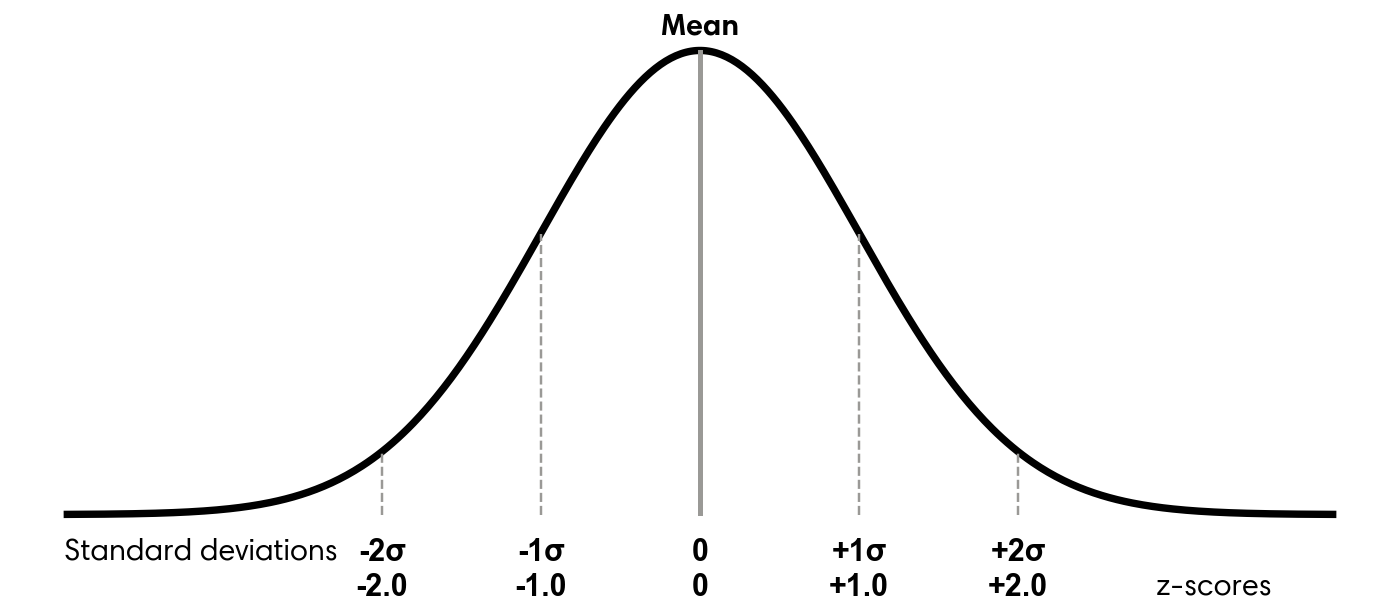
To measure how far values deviate from the center of the data, we use the standard deviation. This statistic describes how spread out the values are. Smaller values indicate tighter clustering, while larger values signal greater dispersion. In a roughly normal distribution, about 68 percent of observations fall within one standard deviation of the mean, and about 95 percent fall within two. The formula for standard deviation is:
\[ \sqrt{\frac{\sum (x_i - \mu)^2}{N}} \]
Here, \(x_i\) represents each observation, \(\mu\) is the mean, the \(\sum\) symbol indicates adding all squared deviations, and \(N\) is the number of observations. Refer to any good statistics text or online resource1 for additional details on how this formula is derived.
Polars computes standard deviation using the std function, which includes a ddof (Delta Degrees of Freedom) parameter. The denominator becomes \(N - ddof\). The default value, ddof=1, is appropriate for sample standard deviation. If your dataset represents the entire population, as is common with customer data, use ddof=0. Setting ddof=1 slightly increases the standard deviation to account for sampling uncertainty. In large datasets, this difference is usually negligible. For example, in the liquor_sales dataframe with 30.7 million rows, the two results differ only beyond the sixth decimal place:
with pl.Config(
    float_precision=10
):
    display(liquor_sales
    .filter(pl.col('Volume_Gal').ge(0))
    .select(Std_Pop_Volume_Gal=pl.col('Volume_Gal').std(ddof=0),
            Std_Samp_Volume_Gal=pl.col('Volume_Gal').std(ddof=1))
    )
shape: (1, 2)
| Std_Pop_Volume_Gal | Std_Samp_Volume_Gal |
|---|---|
| f64 | f64 |
| 8.6846913101 | 8.6846914513 |
Because these differences are so small, either option is suitable for most analytical work.
Once we have the standard deviation, we can calculate how many standard deviations each value lies from the mean. This quantity is known as the z-score and provides a standardized measure of distance from the center. Values above the mean produce positive z-scores, while values below the mean produce negative ones. Figure 5.1 illustrates how z-scores correspond to the normal distribution.
To calculate z-scores for the liquor volume data, start by calculating the overall mean and standard deviation. You can then compute each z-score by subtracting the dataset mean from an individual volume and dividing the result by the standard deviation.
(liquor_sales
 .filter(pl.col('Volume_Gal').ge(0))
 .with_columns(Avg_Volume_Gal=pl.col('Volume_Gal').mean(),
               Std_Dev=pl.col('Volume_Gal').std(ddof=0))
 .with_columns(Z_Score=(pl.col('Volume_Gal') - pl.col('Avg_Volume_Gal')) / pl.col('Std_Dev'))
 .select('City', 'Volume_Gal', 'Avg_Volume_Gal', 'Std_Dev', 'Z_Score')
 .sort('Volume_Gal', descending=True)
)
shape: (30_751_486, 5)
| City | Volume_Gal | Avg_Volume_Gal | Std_Dev | Z_Score |
|---|---|---|---|---|
| str | f64 | f64 | f64 | f64 |
| "WEST DES MOINES" | 998.57 | 2.40437 | 8.684691 | 114.703631 |
| "CORALVILLE" | 998.57 | 2.40437 | 8.684691 | 114.703631 |
| "WEST DES MOINES" | 998.57 | 2.40437 | 8.684691 | 114.703631 |
| "ANKENY" | 998.57 | 2.40437 | 8.684691 | 114.703631 |
| "CORALVILLE" | 998.57 | 2.40437 | 8.684691 | 114.703631 |
| … | … | … | … | … |
| "COUNCIL BLUFFS" | 0.0 | 2.40437 | 8.684691 | -0.276851 |
| "CEDAR FALLS" | 0.0 | 2.40437 | 8.684691 | -0.276851 |
| "CLINTON" | 0.0 | 2.40437 | 8.684691 | -0.276851 |
| "FORT MADISON" | 0.0 | 2.40437 | 8.684691 | -0.276851 |
| "MILFORD" | 0.0 | 2.40437 | 8.684691 | -0.276851 |
The highest recorded volumes produce z-scores approaching 115, while the smallest values are closer to −0.3. This wide gap shows that the largest volumes are much more extreme outliers than those at the lower end of the distribution.
5.3.3 Graphing to Find Anomalies Visually
In addition to sorting values or computing percentiles and standard deviations, visualizing data can make unusual patterns much easier to identify. As discussed in earlier chapters, one key advantage of charts is their ability to condense large amounts of information into a format that is quick to interpret. When examining visualizations, trends and irregular points often stand out immediately, even when they would be difficult to spot by scanning raw tables. Visual tools also make it easier to communicate the structure of the data, along with any potential anomalies, to others.
In this section, I introduce three types of charts that are particularly effective for identifying anomalies: bar charts, scatter plots, and box plots.
A bar chart is commonly used to display a histogram or frequency distribution for a single field. This makes it useful for understanding the overall shape of the data and for identifying extreme values. One axis shows the full range of possible values, while the other shows how frequently each value occurs. The highest and lowest values, along with the overall contour of the distribution, are especially informative. From this type of plot, we can quickly determine whether the data resembles a normal distribution, follows a different pattern, or contains clusters at specific values.
To build a histogram of liquor volumes, start by creating a dataframe that groups and counts each volume value.
to_plot = (liquor_sales
 .filter(pl.col('Volume_Gal').ge(0))
 .group_by('Volume_Gal')
 .agg(Count=pl.len())
 .sort('Volume_Gal')
 )
to_plot
shape: (1_915, 2)
| Volume_Gal | Count |
|---|---|
| f64 | u32 |
| 0.0 | 651 |
| 0.01 | 585115 |
| 0.02 | 308874 |
| 0.03 | 130137 |
| 0.04 | 540 |
| … | … |
| 972.42 | 1 |
| 974.79 | 1 |
| 993.02 | 1 |
| 997.97 | 1 |
| 998.57 | 36 |
Next, create the visualization:
import hvplot.polars
from bokeh.models import NumeralTickFormatter

(to_plot
 .filter(pl.col('Volume_Gal').ge(0))
 .hvplot.bar(x='Volume_Gal', y='Count',
             xlabel='Volume',
             title='Distribution of liquor volumes (2012 to 2024)')
 .opts(yformatter=NumeralTickFormatter(format='0a'),
       default_tools=['pan'])
 )
The resulting chart spans values from 0 to 1,000 gallons, which is consistent with earlier observations. Most entries fall between 0 and approximately 30 gallons, with noticeable peaks near 0 and 0.4 gallons. Because the largest values are visually compressed, it can be helpful to look at a chart that focuses on the upper end of the distribution.
(to_plot
 .filter(pl.col('Volume_Gal').ge(700))
 .hvplot.bar(x='Volume_Gal', y='Count', height=400, xlabel='Volume')
 .opts(title='A zoomed-in view of the distribution of liquor volumes\nfocused on the highest magnitudes',
       default_tools=['pan'])
 )
This zoomed-in view makes the rare, very large volumes easier to see and reveals at least three prominent spikes.
Another visualization that helps expose structure and outliers is the scatter plot. Scatter plots are useful when comparing two numerical variables. The x-axis represents one variable, the y-axis represents the other, and each point corresponds to a pair of values. For example, we can explore the relationship between liquor volume and total sales in dollars. Begin by creating a Polars dataframe that contains each unique volume and sales combination.
to_plot = (liquor_sales
 .filter(pl.col('Volume_Gal').ge(0))
 .group_by('Volume_Gal','Dollars')
 .agg(Counts=pl.len())
 )
to_plot
shape: (86_164, 3)
| Volume_Gal | Dollars | Counts |
|---|---|---|
| f64 | f16 | u32 |
| 19.42 | 1039.0 | 12 |
| 52.7 | 1231.0 | 2 |
| 7.13 | 890.5 | 942 |
| 1.19 | 474.0 | 3 |
| 0.46 | 11.023438 | 179 |
| … | … | … |
| 0.92 | 40.5 | 590 |
| 3.96 | 225.0 | 1992 |
| 85.59 | 6064.0 | 1 |
| 61.02 | 1818.0 | 1 |
| 30.43 | 4072.0 | 1 |
Then create the scatter plot:
(to_plot
1 .with_columns(pl.col('Dollars','Volume_Gal').cast(pl.Float32))
 .hvplot.scatter(x='Volume_Gal', y='Dollars', height=500,
                 xlabel='Volume', ylabel='Sales ($)', alpha=0.6,
                 title='Scatter plot of liquor volume and sales (2012 to 2024)')
 .opts(default_tools=['pan'])
)- 1
- Reduce precision from Float64 to Float32 to prevent scalar overflow in the chart.
This visualization shows the same volume range as before, now plotted against dollar sales, which extend to roughly $70,000. A small number of points represent high-value sales with relatively low volumes, which likely correspond to premium liquor brands. Because the dataset is extremely large, the plot uses grouped combinations rather than all 30.7 million individual rows.
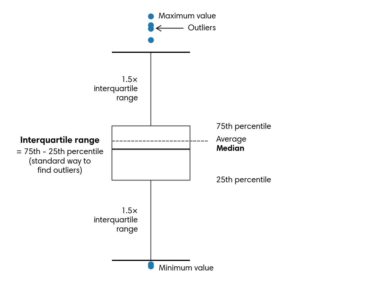
A third visualization that highlights outliers effectively is the box plot, also known as a box-and-whisker plot. This type of chart summarizes the central portion of the data while still displaying extreme values. The box spans the 25th through 75th percentiles, with a line indicating the median. The whiskers extend outward, typically to 1.5 times the interquartile range, and any values beyond them appear as individual outliers. Figure 5.2 explains the parts of a box plot.
In most cases, a box plot includes all observations. However, because this dataset is very large, the example here focuses on liquor transactions from Van Buren County, named after President Martin Van Buren. A fun fact about this president is that he remains the only U.S. president whose first language was not English.
To begin, filter the dataset to get rows where the County column matches this criterion:
to_plot = (liquor_sales
 .filter(pl.col('Volume_Gal').ge(0))
 .filter(pl.col('County') == 'VAN BUREN')
 .select(pl.col('Volume_Gal').sort())
 )
to_plot
shape: (31_292, 1)
| Volume_Gal |
|---|
| f64 |
| 0.0 |
| 0.0 |
| 0.01 |
| 0.01 |
| 0.01 |
| … |
| 13.87 |
| 13.87 |
| 13.87 |
| 13.87 |
| 19.42 |
Then create a box plot:
(to_plot
 .hvplot.box(width=300, height=500,
             ylabel='Volume')
 .opts(title='Liquor volume (2012 to 2024)\nVan Buren county',
       default_tools=['pan'],
       fontsize={'ylabel':11, 'yticks': 11})
 )
While visualizations usually reveal this information on their own, we can also compute the essential box‑plot statistics directly with Polars:
(liquor_sales
 .filter(pl.col('Volume_Gal').ge(0))
 .filter(pl.col('County') == 'VAN BUREN')
 .select(Percentile_25=pl.col('Volume_Gal').quantile(0.25, interpolation='linear'),
         Median=pl.col('Volume_Gal').quantile(0.5, interpolation='linear'),
         Percentile_75=pl.col('Volume_Gal').quantile(0.75, interpolation='linear'))
 .with_columns(IQR=(pl.col('Percentile_75') - pl.col('Percentile_25')) * 1.5)
 .with_columns(Lower_Whisker=pl.col('Percentile_25') - pl.col('IQR'),
               Upper_Whisker=pl.col('Percentile_75') + pl.col('IQR'))
)
shape: (1, 6)
| Percentile_25 | Median | Percentile_75 | IQR | Lower_Whisker | Upper_Whisker |
|---|---|---|---|---|---|
| f64 | f64 | f64 | f64 | f64 | f64 |
| 0.5 | 1.18 | 2.77 | 3.405 | -2.905 | 6.175 |
For Van Buren, the median value of liquor sale volume is 1.18 gallons, and the whiskers stretch from –2.905 up to 6.175. The dots on the chart indicate unusually small or unusually large sale volumes.
Box plots are also helpful when comparing different segments of the data to pinpoint where unusual values appear. As an illustration, we can look at how liquor volumes in Van Buren vary by year. We begin by creating a Year column from Date, which will accompany Volume_Gal in the resulting dataset:
to_plot = (liquor_sales
 .filter(pl.col('Volume_Gal').ge(0))
 .filter(pl.col('County') == 'VAN BUREN')
 .select(pl.col('Date').dt.year().alias('Year'), 'Volume_Gal')
 .sort(pl.nth(0,1))
 )
to_plot
shape: (31_292, 2)
| Year | Volume_Gal |
|---|---|
| i32 | f64 |
| 2012 | 0.08 |
| 2012 | 0.08 |
| 2012 | 0.1 |
| 2012 | 0.1 |
| 2012 | 0.13 |
| … | … |
| 2024 | 7.13 |
| 2024 | 7.13 |
| 2024 | 7.13 |
| 2024 | 7.13 |
| 2024 | 8.32 |
Next, we visualize the new dataframe:
(to_plot
 .with_columns(pl.col('Volume_Gal').cast(pl.Float32))
 .hvplot.box(y='Volume_Gal', by='Year', height=400,
             xlabel='', ylabel='Volume',
             title='Box plot of liquor volumes in Van Buren county by year')
 .opts(fontsize={'ylabel':10, 'ticks': 10},
       default_tools=['pan'])
 )
Although the median and the spread of the boxes shift somewhat from one year to the next, they generally stay within the 1 to 3 gallon range. Van Buren rarely records very large liquor sales. The biggest volume occurred in 2013, reaching almost 20 gallons.
Bar charts, scatter plots, and box plots are all effective tools for spotting and understanding outliers. They help us make sense of large datasets quickly and begin forming a narrative about what the data shows. Combined with techniques like sorting, percentile calculations, and standard deviation, visualizations play a central role in identifying anomalies. With these methods established, we can now explore the different types of anomalies beyond those already introduced.
5.4 Forms of Anomalies
Anomalies can take many forms. In this section, I outline three broad categories: unusual values, unexpected counts or frequencies, and surprising presence or absence of data. Together, these categories provide a practical foundation for exploring any dataset, whether you are performing general profiling or investigating specific concerns. Outliers and other irregular patterns are often tied to domain-specific factors, so the more context you have about how the data was generated, the easier it is to interpret what you observe. Even so, these categories and techniques offer reliable starting points for deeper analysis.
5.4.1 Anomalous Values
One of the most common forms of anomalies involves individual values that stand out. These may be extremely large or small, or they may fall within an otherwise typical range but behave in ways that do not align with the rest of the distribution.
In the previous section, we explored several approaches for identifying outliers, including sorting, percentile-based methods, standard deviation thresholds, and visualizations. Using these tools, we saw that the liquor sales dataset contains both exceptionally high liquor volumes and some values that appear unusually low.
Beyond locating anomalous values, it is often useful to understand the conditions that produced them or to identify other attributes that tend to accompany them. This is where analytical curiosity and investigative thinking become essential. For example, 37 rows in the dataset involve transactions exceeding 65 thousand dollars. A natural next step is to determine which cities these unusually large transactions occurred in. Let us examine the source:
(liquor_sales
 .filter(pl.col('Dollars') > 65_000)
 .group_by('City')
 .agg(Count=pl.len())
 )
shape: (6, 2)
| City | Count |
|---|---|
| str | u32 |
| "TEMPLETON" | 1 |
| "WEST DES MOINES" | 3 |
| "DES MOINES" | 10 |
| "DAVENPORT" | 1 |
| "URBANDALE" | 20 |
| "IOWA CITY" | 2 |
We can also inspect which specific items were associated with these high-value transactions:
(liquor_sales
 .filter(pl.col('Dollars') > 65_000)
 .group_by('Item')
 .agg(Count=pl.len())
 )
shape: (14, 2)
| Item | Count |
|---|---|
| str | u32 |
| "MAKERS MARK" | 6 |
| "BAILEY'S ORIGINAL IRISH CREAM" | 1 |
| "CROWN ROYAL CANADIAN WHISKY" | 2 |
| "JOHNNIE WALKER BLUE" | 1 |
| "TITOS HANDMADE VODKA" | 6 |
| … | … |
| "CROWN ROYAL" | 6 |
| "CROWN ROYAL W/NFL JERSEY BAG" | 1 |
| "CROWN ROYAL PEACH" | 1 |
| "MAKER'S MARK" | 2 |
| "ABSOLUT W/4-50MLS" | 1 |
It is important to note that this does not mean a single bottle, such as Bailey’s Original Irish Cream, costs more than $65,000. Instead, these totals likely reflect large quantities of the same product purchased in a single transaction.
5.4.2 Anomalous Counts or Frequencies
Sometimes anomalies do not come from individual values but from patterns of activity. A person buying a $100 gift card at a grocery store is normal. That same person buying a $100 gift card every ten minutes for an entire afternoon would be highly suspicious.
Clusters or bursts of activity can signal anomalies in many ways, and the relevant dimensions depend heavily on the dataset. Time and location are common across many domains and are present in the liquor sales dataset, so I will use them to demonstrate the techniques in this section. These same approaches can be applied to other attributes as well.
Events that occur far more frequently than expected within a short time window can indicate unusual behavior. This behavior can be positive, such as when a product goes viral and sales surge. It can also be negative, such as when abrupt spikes suggest fraudulent transactions or attempts to overwhelm a system with excessive traffic. To evaluate these patterns and determine whether they deviate from typical behavior, we first aggregate the data appropriately and then apply the techniques introduced earlier in this chapter, along with the time series methods discussed in Chapter 3.
In the examples that follow, I walk through a sequence of steps that reveal normal patterns and highlight unusual ones. This process is iterative and relies on profiling, domain knowledge, and insights gained from earlier results. We begin by examining yearly transaction counts. These can be computed by truncating the Date column to the year and counting the records:
(liquor_sales
 .filter(pl.col('Volume_Gal').ge(0))
 .with_columns(Transaction_Year=pl.col('Date').dt.truncate('1y').cast(pl.Date))
 .group_by('Transaction_Year')
 .agg(Transactions=pl.len())
 .sort(pl.nth(0))
)
shape: (13, 2)
| Transaction_Year | Transactions |
|---|---|
| date | u32 |
| 2012-01-01 | 2080569 |
| 2013-01-01 | 2062145 |
| 2014-01-01 | 2096013 |
| 2015-01-01 | 2182757 |
| 2016-01-01 | 2278554 |
| … | … |
| 2020-01-01 | 2614339 |
| 2021-01-01 | 2622689 |
| 2022-01-01 | 2563448 |
| 2023-01-01 | 2635862 |
| 2024-01-01 | 2587985 |
We observe that 2012 and 2013 had relatively few liquor transactions compared to later years. From 2014 onward, transaction counts increased steadily through 2019. In 2020, the number of transactions rose sharply. One possible explanation is that during the pandemic, people spent more time at home and may have consumed more alcohol. Another possibility is a data issue, such as duplicated records. To investigate further, we can examine the data at a monthly level:
to_plot = (liquor_sales
 .filter(pl.col('Volume_Gal').ge(0))
 .with_columns(Transaction_Month=pl.col('Date').dt.truncate('1mo').cast(pl.Date))
 .group_by('Transaction_Month')
 .agg(Transactions=pl.len())
 .sort(pl.nth(0))
)
to_plot
shape: (156, 2)
| Transaction_Month | Transactions |
|---|---|
| date | u32 |
| 2012-01-01 | 147684 |
| 2012-02-01 | 156583 |
| 2012-03-01 | 160434 |
| 2012-04-01 | 164840 |
| 2012-05-01 | 192146 |
| … | … |
| 2024-08-01 | 213749 |
| 2024-09-01 | 200336 |
| 2024-10-01 | 223504 |
| 2024-11-01 | 216874 |
| 2024-12-01 | 244199 |
Because this dataframe contains many rows, visualizing it can provide clearer insight.
(to_plot
 .hvplot.line(x='Transaction_Month', y='Transactions',
              xlabel='Month', height=400)
 .opts(yformatter=NumeralTickFormatter(format='0a'),
       title='Number of liquor transactions per month',
       default_tools=['pan'])
 )
Although monthly transaction counts fluctuate, there is a clear upward trend beginning in 2014. A few months stand out as clear outliers, including December 2020 and December 2021.
From here, we can continue exploring finer time intervals, optionally filtering to specific ranges to focus on unusual periods. After identifying the exact days when spikes occurred, we may want to break the data down further using additional attributes from a joined dataset. This can help determine whether anomalies are legitimate or the result of data quality problems. For example, it turns out that El Paso County is located in Colorado, not Iowa, and that some rows contain null County values.
Next, we load the population dataset and create a Pop_Bucket column that groups counties into low, medium, and high population categories using quantiles:
df = (pl.read_csv('data/iowa_county_population.csv')
 .with_columns(pl.col('County').str.to_uppercase())
 )

# Compute quantiles
q1, q2 = (df
 .select(q1=pl.col('Population').quantile(1/3, interpolation='linear'),
         q2=pl.col('Population').quantile(2/3, interpolation='linear'))
 .row(0)
)

population = (df
 .with_columns(pl.when(pl.col('Population') <= q1)
               .then(pl.lit('Low'))
               .when(pl.col('Population') <= q2)
               .then(pl.lit('Medium'))
               .otherwise(pl.lit('High'))
               .alias('Pop_Bucket'))
 )
population
shape: (99, 5)
| County | Population | Area_Sqr_Mile | Density | Pop_Bucket |
|---|---|---|---|---|
| str | i64 | i64 | i64 | str |
| "WRIGHT" | 12714 | 580 | 22 | "Medium" |
| "WORTH" | 7292 | 400 | 18 | "Low" |
| "WOODBURY" | 107970 | 873 | 124 | "High" |
| "WINNESHIEK" | 19718 | 690 | 29 | "High" |
| "WINNEBAGO" | 10203 | 400 | 26 | "Low" |
| … | … | … | … | … |
| "AUDUBON" | 5591 | 443 | 13 | "Low" |
| "APPANOOSE" | 12083 | 497 | 24 | "Medium" |
| "ALLAMAKEE" | 14200 | 639 | 22 | "Medium" |
| "ADAMS" | 3659 | 423 | 9 | "Low" |
| "ADAIR" | 7463 | 569 | 13 | "Low" |
Tip
We could’ve written much shorter code that uses the qcut expression to return the same dataframe as population:
(df
 .with_columns(pl.col('Population').qcut([1/3, 2/3], labels=['Low', 'Medium', 'High'])
               .alias('Pop_Bucket'))
 )
However, the Polars documentation warns that qcut is unstable may be changed at any point without it being considered a breaking change. I’ve chosen to do it the long way so we can have robust code.
Now we can join population with liquor_sales and continue the analysis:
to_plot = (liquor_sales
 .filter(pl.col('Volume_Gal').ge(0))
 .select('County', Transaction_Month=pl.col('Date').dt.truncate('1mo').cast(pl.Date))
 .join(population.select('County','Pop_Bucket'), on='County', how='inner')
 .group_by('Transaction_Month', 'Pop_Bucket')
 .agg(Transactions=pl.len())
 .sort('Transaction_Month')
 )
to_plot
shape: (468, 3)
| Transaction_Month | Pop_Bucket | Transactions |
|---|---|---|
| date | str | u32 |
| 2012-01-01 | "High" | 112944 |
| 2012-01-01 | "Low" | 10682 |
| 2012-01-01 | "Medium" | 23754 |
| 2012-02-01 | "Medium" | 23504 |
| 2012-02-01 | "High" | 121731 |
| … | … | … |
| 2024-11-01 | "Low" | 13794 |
| 2024-11-01 | "Medium" | 30707 |
| 2024-12-01 | "High" | 195905 |
| 2024-12-01 | "Low" | 14133 |
| 2024-12-01 | "Medium" | 34033 |
The resulting graph shows the expected pattern. Counties with smaller populations have fewer transactions, followed by medium-population counties and then high-population counties. While nothing unusual appears here, the join operation did help clean the data by removing invalid counties, such as El Paso, and rows with missing county information.
(to_plot
 .pivot(index='Transaction_Month', on='Pop_Bucket', values='Transactions')
 .hvplot.line(x='Transaction_Month', y=['Low','Medium','High'],
              xlabel='Month', ylabel='Transactions', height=500,
              legend='top_left', legend_opts={'title':''}, legend_cols=3)
 .opts(title='Number of transactions per month\n(split by population bucket)',
       yformatter=NumeralTickFormatter(format='0a'),
       default_tools=['pan'])
 )
Identifying anomalous counts, sums, or frequencies typically requires examining the data iteratively at multiple levels of detail. Analysts often start with a broad view, drill down to finer granularity, zoom out to compare against overall trends, and then zoom back in on specific dimensions. Polars makes this type of exploratory workflow efficient, and combining these methods with the time series techniques from Chapter 3 can further strengthen the analysis.
5.4.3 Anomalies from the Absence of Data
We have seen how unusually high event frequencies can signal anomalies. It’s equally important to remember that the absence of records can also indicate anomalies. For instance, consider a security system that tracks motion inside a building. If the sensors suddenly stop reporting activity when movement is expected, an alert is triggered, just as it would be if the sensors detected unusual or erratic motion. In many analytical contexts, however, missing activity is harder to detect because it does not call attention to itself. Users seldom signal that they’re preparing to leave. They simply taper off their engagement with a product or service until their activity disappears from the data entirely.
One way to surface these silent anomalies is to explicitly query for gaps, such as the time since an entity was last observed. Cities with larger populations in our liquor_sales dataset are more likely to consume more liquor, which makes extended gaps in their transaction history more notable. Using Polars, we can measure the gaps between high-volume liquor transactions and calculate how long it has been since the most recent one for each city:
(liquor_sales
 .filter(pl.col('Volume_Gal').ge(700),
         pl.col('County').ne('EL PASO'),
         pl.col('County').is_not_null())
 .with_columns(Next_Date=pl.col('Date').shift(-1).over('City'),
               Latest=pl.col('Date').max().over('City'))
 .with_columns(Gap=pl.col('Next_Date') - pl.col('Date'))
 .with_columns(Days_Since_Latest=(pl.date(2024, 12, 31) - pl.col('Latest')).dt.total_days())
 .group_by('City','Days_Since_Latest')
 .agg(Transactions=pl.len(),
      Avg_Gap=pl.col('Gap').mean().dt.total_days(),
      Max_Gap=pl.col('Gap').max().dt.total_days())
)
shape: (18, 5)
| City | Days_Since_Latest | Transactions | Avg_Gap | Max_Gap |
|---|---|---|---|---|
| str | i64 | u32 | i64 | i64 |
| "SIOUX CITY" | 1561 | 1 | null | null |
| "WINDSOR HEIGHTS" | 251 | 13 | 47 | 3858 |
| "CEDAR RAPIDS" | 363 | 4 | 289 | 2938 |
| "CARROLL" | 4470 | 1 | null | null |
| "DUBUQUE" | 907 | 2 | 658 | 658 |
| … | … | … | … | … |
| "COUNCIL BLUFFS" | 1000 | 3 | -1488 | -560 |
| "MASON CITY" | 418 | 4 | 287 | 1470 |
| "WATERLOO" | 257 | 7 | 123 | 373 |
| "DENISON" | 3505 | 2 | -385 | -385 |
| "ANKENY" | 223 | 8 | 80 | 623 |
This pipeline begins by filtering the liquor_sales dataframe to include only transactions with volumes of 700 gallons or more. It also removes rows associated with invalid or missing county values. Next, several windowed calculations are performed within each City. A shifted version of the Date column captures the date of the next transaction for that city, while a windowed maximum identifies the most recent transaction date.
The code computes the gap between consecutive transactions by subtracting the current transaction date from the next one. To measure how long it has been since the last recorded high-volume transaction, it subtracts each city’s most recent date from a fixed reference point, December 31, 2024. This date corresponds to the latest entry in the liquor_sales dataset, and the resulting duration is converted to days.
What this produces is a dataframe that shows, for each city, how many high-volume transactions occurred, the average and maximum number of days between those transactions, and the time elapsed since the most recent one. Taken together, these measures help surface cities where the absence of expected activity may warrant closer examination.
On its own, time since the most recent high-volume transaction may not be strongly predictive. In many domains, however, measures such as inactivity gaps or time since last event provide meaningful signals. By understanding the typical spacing between actions, we establish a baseline against which the current interval can be evaluated.
If the present gap is consistent with historical patterns, we can reasonably assume that the customer remains engaged. When the gap extends well beyond what has been observed in the past, the risk of churn increases. Queries that produce historical gap values can also be examined for anomalies, helping answer questions such as the longest period a customer was inactive before eventually returning.
5.5 Handling Anomalies
Anomalies can appear in data for many reasons and often take different forms, as we have already seen. Once they are identified, the next step is deciding how to handle them. The appropriate response depends on both the source of the anomaly, whether it reflects a real process or a data quality issue, and the purpose of the dataset or analysis. Common options include investigating the issue without altering the data, removing affected records, substituting values, adjusting scales, or correcting the problem at its source.
5.5.1 Investigation
Understanding why an anomaly exists is usually the first step in deciding how to address it. This phase can be both engaging and frustrating. It’s engaging because solving a data puzzle often requires creativity and careful reasoning. It’s frustrating because deadlines still apply, and the search for answers can feel endless, sometimes raising doubts about the reliability of the entire analysis.
When investigating anomalies, I typically build my code incrementally and examine intermediate results along the way. I alternate between looking for broad patterns and inspecting individual records. A genuine outlier often becomes obvious quickly. When that happens, I isolate the full row containing the unusual value and look for clues related to timing, origin, or other relevant attributes. I then examine similar records to see whether they also contain unexpected values. For example, I might compare entries from the same date to determine whether they look typical or unusual. In website traffic or product purchase data, related irregularities may also appear.
If the data originates within my organization, I usually follow up with product owners or other stakeholders after exploring the anomaly’s context. Sometimes the issue corresponds to a known defect. In other cases, it reveals a deeper process or system problem that requires attention, and additional context helps clarify what is happening. With external or publicly available data, identifying the true cause may not be possible. In those situations, the goal is to gather enough insight to choose the most appropriate handling strategy from the options that follow.
5.5.2 Removal
One of the simplest ways to handle anomalies is to remove them from the dataset. This approach makes sense when there is strong reason to believe that a data collection error affected the entire record. Removal is also appropriate when the dataset is large enough that excluding a small number of rows will not materially affect the results. Another justification is when extreme outliers would distort the analysis to the point that the conclusions become unreliable.
Earlier, we noted that the liquor_sales dataset contains several entries with negative volumes. Because only a small fraction of records have negative values, it is reasonable to assume that they are errors or represent refunds. Removing these rows is straightforward using the filter method:
(liquor_sales
 .filter(pl.col('Volume_Gal').ge(0))
 .head()
 )
shape: (5, 24)
| Invoice | Date | Store_Num | Store | Address | City | Zip_Code | Location | County_Num | County | Category_Num | Category | Vendor_Num | Vendor | Item_Num | Item | Pack | Bottle_Vol_ml | Cost | Retail | Bottles | Dollars | Volume_Ltr | Volume_Gal |
|---|---|---|---|---|---|---|---|---|---|---|---|---|---|---|---|---|---|---|---|---|---|---|---|
| str | date | i16 | str | str | str | i64 | str | str | str | i64 | str | i16 | str | i64 | str | i64 | i32 | f16 | f16 | i32 | f16 | f16 | f64 |
| "INV-71393800027" | 2024-06-19 | 5187 | "KWIK STOP LIQUOR & GROCERIES A… | "125 6TH ST" | "AMES" | 50010 | "POINT (-93.611679978 42.027185… | null | "STORY" | 1022100 | "MIXTO TEQUILA" | 395 | "PROXIMO" | 89199 | "JOSE CUERVO ESPECIAL REPOSADO … | 12 | 375 | 6.53125 | 9.796875 | 12 | 117.625 | 4.5 | 1.18 |
| "INV-71387600015" | 2024-06-19 | 3045 | "BRITT FOOD CENTER" | "8 2ND ST NW" | "BRITT" | 50423 | "POINT (-93.802630964 43.099021… | null | "HANCOCK" | 1031200 | "AMERICAN FLAVORED VODKA" | 380 | "PHILLIPS BEVERAGE" | 42079 | "UV CAKE" | 12 | 1000 | 7.5 | 11.25 | 2 | 22.5 | 2.0 | 0.52 |
| "INV-71392700079" | 2024-06-19 | 4129 | "CYCLONE LIQUORS" | "626 LINCOLN WAY" | "AMES" | 50010 | "POINT (-93.618248037 42.021326… | null | "STORY" | 1082200 | "IMPORTED SCHNAPPS" | 421 | "SAZERAC COMPANY INC" | 69637 | "DR MCGILLICUDDYS CHERRY" | 12 | 1000 | 11.25 | 16.875 | 12 | 202.5 | 12.0 | 3.17 |
| "INV-71420400062" | 2024-06-20 | 5889 | "SUPER QUICK LIQUOR / WDM" | "1800 22ND ST" | "WEST DES MOINES" | 50266 | "POINT (-93.736764041 41.599012… | null | "POLK" | 1082100 | "IMPORTED CORDIALS & LIQUEURS" | 305 | "MHW LTD" | 64000 | "ABSENTE" | 12 | 750 | 24.625 | 36.9375 | 2 | 73.875 | 1.5 | 0.39 |
| "INV-71346200003" | 2024-06-18 | 5413 | "LIL' CHUBS CORNER STOP" | "712 S OAK ST" | "INWOOD" | 51240 | "POINT (-96.430479985 43.302142… | null | "LYON" | 1012100 | "CANADIAN WHISKIES" | 259 | "HEAVEN HILL BRANDS" | 10550 | "BLACK VELVET TOASTED CARAMEL" | 12 | 750 | 6.0 | 9.0 | 1 | 9.0 | 0.75 | 0.19 |
Before deleting records, it is often useful to check whether the outliers meaningfully affect the results. For instance, we might examine whether the average volume changes when the negative values are excluded, since averages are particularly sensitive to extreme values. The following comparison shows the overall average alongside the average computed using only nonnegative values:
(liquor_sales
 .select(Avg_Volume=pl.col('Volume_Gal').mean(),
         Avg_Volume_Adjusted=pl.col('Volume_Gal').filter(pl.col('Volume_Gal').ge(0)).mean())
 )
shape: (1, 2)
| Avg_Volume | Avg_Volume_Adjusted |
|---|---|
| f64 | f64 |
| 2.40326 | 2.40437 |
The two averages differ only in the third decimal place, 2.403 versus 2.404, which is a negligible shift. However, if we focus on Scott County, one of the counties with many negative entries, the difference appears in the second decimal place:
(liquor_sales
 .filter(pl.col('County') == 'SCOTT')
 .select(Avg_Volume=pl.col('Volume_Gal').mean(),
         Avg_Volume_Adjusted=pl.col('Volume_Gal').filter(pl.col('Volume_Gal').ge(0)).mean())
 )
shape: (1, 2)
| Avg_Volume | Avg_Volume_Adjusted |
|---|---|
| f64 | f64 |
| 2.689077 | 2.690168 |
Although the values are still close, the difference between 2.68 and 2.69 may matter depending on the precision required for the analysis. In this case, removal is likely the better choice.
There are two main ways to remove outliers in practice. You can use filter to exclude them from all subsequent operations, or you can use select to exclude them only for specific calculations. The appropriate approach depends on the analytical context and on whether retaining the original rows is important for counts or other derived metrics.
5.5.3 Replacement with Alternate Values
Rather than discarding entire rows, anomalous values can often be handled by replacing them with more appropriate ones. These replacements may be defaults, stand-ins, values clipped to a reasonable range, or summary statistics such as the average or median.
Earlier, we saw how missing values can be filled using the fill_null function. When values are present but still need correction, a when-then-otherwise expression makes it possible to replace them selectively. For example, if we list the ten stores with the highest number of transactions, many belong to the Hy-Vee chain but appear under slightly different names. If distinguishing between Hy-Vee Food Store and Hy-Vee Wine and Spirits is not important, all stores containing “Hy-Vee” can be grouped under a single label.
Here is the top-ten list without any consolidation:
(liquor_sales
 .group_by('Store').len()
 .sort('len')
 .tail(10)
 )
shape: (10, 2)
| Store | len |
|---|---|
| str | u32 |
| "HY-VEE FOOD STORE #5 / CEDAR R… | 133072 |
| "HY-VEE WINE AND SPIRITS / IOWA… | 141550 |
| "HY-VEE #4 / WDM" | 141890 |
| "BENZ DISTRIBUTING" | 142636 |
| "HY-VEE #7 / CEDAR RAPIDS" | 152449 |
| "HY-VEE WINE AND SPIRITS / BETT… | 159464 |
| "HY-VEE FOOD STORE / CEDAR FALL… | 162727 |
| "CENTRAL CITY LIQUOR, INC." | 187547 |
| "CENTRAL CITY 2" | 219737 |
| "HY-VEE #3 / BDI / DES MOINES" | 251312 |
Here is the same list after consolidating all Hy-Vee locations under one name. Notice that the len value for Hy-Vee now reflects the combined counts of all individual Hy-Vee stores shown in the previous output.
(liquor_sales
 .with_columns(pl.when(pl.col('Store').str.contains('HY-VEE'))
               .then(pl.lit('HY-VEE'))
               .otherwise(pl.col('Store'))
               .alias('Store')
               )
 .group_by('Store').len()
 .sort('len')
 .tail(10)
 )
shape: (10, 2)
| Store | len |
|---|---|
| str | u32 |
| "LOT-A-SPIRITS" | 86356 |
| "QUICK SHOP / CLEAR LAKE" | 88724 |
| "CHARLIE'S WINE AND SPIRITS," | 99741 |
| "HAPPY'S WINE & SPIRITS" | 103747 |
| "WILKIE LIQUORS" | 105234 |
| "CYCLONE LIQUORS" | 127086 |
| "BENZ DISTRIBUTING" | 142636 |
| "CENTRAL CITY LIQUOR, INC." | 187547 |
| "CENTRAL CITY 2" | 219737 |
| "HY-VEE" | 9758981 |
Although this approach reduces the granularity of the dataset, it can be a practical way to simplify categories that contain many inconsistent or irregular entries. When you know that an outlier value is incorrect and you know what it should be, a when-then-otherwise replacement allows you to correct the value while preserving the rest of the row. This situation often arises when an extra digit is introduced or when a measurement is recorded in the wrong unit.
For numerical outliers, another common strategy is to replace extreme values with the nearest reasonable value. This preserves the overall shape of the distribution while preventing extreme points from disproportionately influencing summary statistics. Winsorization is a formal version of this idea. Values above a chosen upper percentile, such as the 95th, are set to that percentile, and values below a lower percentile, such as the 5th, are raised to that threshold. To implement this in Polars, we first compute the cutoff values:
(liquor_sales
 .select(Percentile_95=pl.col('Volume_Gal').quantile(0.95, interpolation='linear'),
         Percentile_05=pl.col('Volume_Gal').quantile(0.05, interpolation='linear'))
)
shape: (1, 2)
| Percentile_95 | Percentile_05 |
|---|---|
| f64 | f64 |
| 5.55 | 0.1 |
We can build on the code above by using with_columns in place of select and introducing a when-then-otherwise expression to clamp values outside the 5th to 95th percentile range:
(liquor_sales
 .with_columns(Percentile_95=pl.col('Volume_Gal').quantile(0.95, interpolation='linear'),
               Percentile_05=pl.col('Volume_Gal').quantile(0.05, interpolation='linear'))
 .with_columns(pl.when(pl.col('Volume_Gal') > pl.col('Percentile_95'))
               .then(pl.col('Percentile_95'))
               .when(pl.col('Volume_Gal') < pl.col('Percentile_05'))
               .then(pl.col('Percentile_05'))
               .otherwise(pl.col('Volume_Gal'))
               .alias('Volume_Winsorized'))
 .select('Date','City','Volume_Gal','Volume_Winsorized')
)
shape: (30_759_230, 4)
| Date | City | Volume_Gal | Volume_Winsorized |
|---|---|---|---|
| date | str | f64 | f64 |
| 2024-06-19 | "AMES" | 1.18 | 1.18 |
| 2024-06-19 | "BRITT" | 0.52 | 0.52 |
| 2024-06-19 | "AMES" | 3.17 | 3.17 |
| 2024-06-20 | "WEST DES MOINES" | 0.39 | 0.39 |
| 2024-06-18 | "INWOOD" | 0.19 | 0.19 |
| … | … | … | … |
| 2024-06-19 | "OSKALOOSA" | 3.17 | 3.17 |
| 2024-06-19 | "WINDSOR HEIGHTS" | 2.77 | 2.77 |
| 2024-06-19 | "EMMETSBURG" | 0.01 | 0.1 |
| 2024-06-19 | "SPIRIT LAKE" | 0.01 | 0.1 |
| 2024-06-20 | "CEDAR FALLS" | 0.19 | 0.19 |
In this example, 0.1 represents the 5th-percentile cutoff and 5.55 represents the 95th. Values outside this range are replaced with the corresponding boundary in the Volume_Winsorized column, while values within the interval remain unchanged. There is no single correct choice of percentiles. You may use 1st and 99th, 0.1th and 99.9th, or other thresholds depending on how extreme and frequent the outliers are and how much smoothing is appropriate for your analysis.
5.5.4 Rescaling
Instead of discarding rows or modifying extreme values, rescaling provides a way to preserve every observation while making the data easier to analyze and visualize.
We introduced the z‑score earlier, but it’s helpful to remember that it also serves as a method for standardizing values. One advantage of the z‑score is that it works naturally with both negative and positive numbers.
Another common transformation is converting values to a logarithmic, or log, scale. Log scaling preserves the relative ordering of values while spreading out smaller numbers. Because log-scaled values can be transformed back to their original units, interpretation remains practical. The primary limitation is that logarithms cannot be applied to negative values.
The Volume_Gal column represents volume measured in gallons. In the example below, both the raw gallon values and their log10 equivalents are retrieved and then visualized to highlight the contrast. By default, a base-10 logarithm is used. To simplify the plotted output, volumes are rounded to one decimal place using round. Rows with a value of 0 are removed because their log value would be negative infinity (-inf).
to_plot = (liquor_sales
 .with_columns(pl.col('Volume_Gal').round(1))
 .filter(pl.col('Volume_Gal').gt(0))
 .with_columns(Log_Volume=pl.col('Volume_Gal').log10())
 .group_by('Volume_Gal','Log_Volume')
 .agg(Transactions=pl.len())
)
to_plot
shape: (1_188, 3)
| Volume_Gal | Log_Volume | Transactions |
|---|---|---|
| f64 | f64 | u32 |
| 344.0 | 2.536558 | 8 |
| 32.9 | 1.517196 | 2 |
| 280.6 | 2.448088 | 2 |
| 132.4 | 2.121888 | 1 |
| 51.2 | 1.70927 | 1 |
| … | … | … |
| 710.1 | 2.85132 | 10 |
| 185.8 | 2.269046 | 29 |
| 161.3 | 2.207634 | 1 |
| 76.3 | 1.882525 | 1 |
| 24.0 | 1.380211 | 12 |
Below is a chart showing the distribution of transactions using the unscaled gallon values:
(to_plot
 .with_columns(pl.col('Volume_Gal').cast(pl.Float32))
 .hvplot.bar(x='Volume_Gal', y='Transactions',
             xlabel='Volume', ylabel='Transactions',
             title='Distribution of positive volumes for liquor transactions\n(2012 to 2024)')
 .opts(yformatter=NumeralTickFormatter(format='0a'),
       default_tools=['pan'])
 )
Below is the same distribution, but with the log-scaled volume on the x-axis:
(to_plot
 .with_columns(pl.col('Volume_Gal').cast(pl.Float32))
 .hvplot.bar(x='Log_Volume', y='Transactions',
             xlabel='Volume (log scale)', ylabel='Transactions',
             title='Distribution of positive volumes for liquor transactions\n(2012 to 2024)')
 .opts(yformatter=NumeralTickFormatter(format='0a'),
       default_tools=['pan'])
 )
In the plot using the original gallon values, many transactions cluster between roughly 0 and 20 gallons. Beyond that range, the distribution becomes difficult to interpret because the x-axis extends to 998.6 to capture the full span of values. After switching to a log scale, the structure among smaller volumes becomes much clearer. For instance, the sharp increase at 0.38, which corresponds to 2.4 gallons, is immediately apparent.
Tip
You can choose different bases for the log function, such as log(base=2) for base-2 logs. Polars also provides a dedicated base-10 function, log10, which is equivalent to calling log(base=10).
Rescaling can be applied directly within Polars or, in many cases, handled by plotting libraries themselves. Log transformations are particularly useful when data spans a wide range of positive values and the most informative patterns occur among the smaller ones.
As with any analytical task, the most appropriate approach to handling unusual values depends on your goals and your understanding of the dataset. Removing outliers is often the simplest option, but when retaining all observations is important, techniques such as winsorizing or rescaling provide effective alternatives.
5.6 Conclusion
Identifying anomalies is a routine part of data analysis. In some cases, the objective is simply to detect them, while in others the goal is to adjust them so the dataset is better suited for further analysis. Sorting, calculating percentiles, and visualizing results of Polars code all offer efficient ways to uncover these irregularities. Anomalies may appear as extreme values, unexpected spikes in activity, or surprising gaps. Domain knowledge is often essential for interpreting their causes. Possible responses include investigating the source, removing problematic records, substituting alternative values, or applying rescaling techniques. The appropriate choice depends on the analytical objective, and Polars supports each of these strategies. In the next chapter, we’ll shift our focus to experimentation, examining how to determine whether an entire group differs meaningfully from a control group.
https://www.statisticshowto.com/probability-and-statistics/standard-deviation offers a clear explanation.↩︎